I joined This.cm a few weeks back and have been thrilled with the quality and diversity of content that is shared by its community. If you haven't heard about 'This,' it's a social media platform where users share one (and only one) link per day, presumably the best thing they had run across in the past 24 hours.
The premise works. Very, very well.
Great things to read are constantly surfaced, and at this point in the young site's growth, all of them are really convenient to browse. The golden ticket thus far has been the pairing of depth and breadth, those elusive partners of successfully curating content. Having wickedly smart and interesting folks in the mix doesn't hurt.
This.cm provides a welcome antidote to the paralysis I have felt while standing in the stream of every social media newsfeed or news aggregator. Cutting through the noise has been easier than ever, and is something that I hope the site continues to conquer as it grows.
With a long weekend ahead and feeling a bit under the weather, I figured it would be a fun exercise to take a peek at what has been the functional foundation of all the great content I have seen so far. To do so, I created a This.cm dataset which includes submission data from 11/1/2014 to 2/13/2015. The dataset includes URL submission, user name, high-level domain, number of thanks, and title. This extracted data was then cleaned up and loaded into a data model for quick analysis and future additions.
The easiest place to start is with the big numbers. During the sample's time frame, nearly 19,000 submissions have been posted on This.cm. Of these, almost 14,000 are unique and they originate from about 3,500 distinct domains. To see how these distinct submissions have been added to the site over time, here is a basic figure:
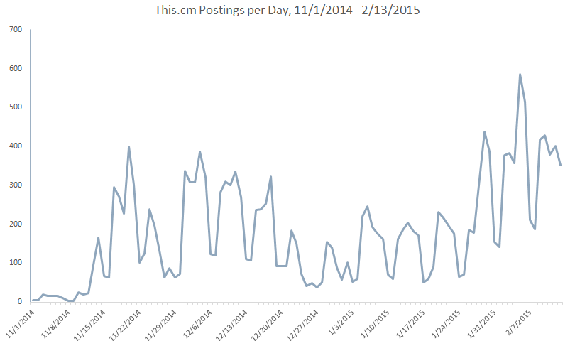
There is a definite trend to the rise of daily content being added to This.cm (yay!). Invites to the site are being sent out and articles are being written about it (here, here, here). I know I'm proselytizing within my own circles.
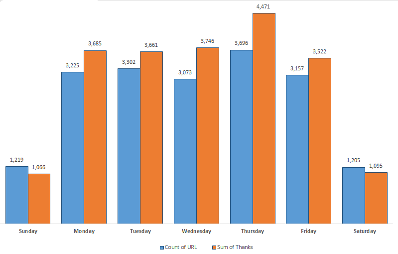
The valleys in the above figure are largely weekends. This is consistent with non-mobile sites, itself being one of the critiques that has been lobbed at This.cm (which is currently strongest in the desktop experience). To break out this relationship among days of the week, here is another figure that splits submissions and number of thanks submitted per weekday:
The valleys in the above figure are largely weekends. This is consistent with non-mobile sites, itself being one of the critiques that has been lobbed at This.cm (which is currently strongest in the desktop experience). To break out this relationship among days of the week, here is another figure that splits submissions and number of thanks submitted per weekday:
All of this is fine and dandy, but what really interested me was the sources behind the content being recommended as the best of the day. A little bit of normalization later to determine domain-level usage, and we have a quick Pareto diagram that shows both the extremely long-tail of distinct domains as well as the smaller percentage of domains that make up the bulk of content (saving Zipf's Law for another day...).
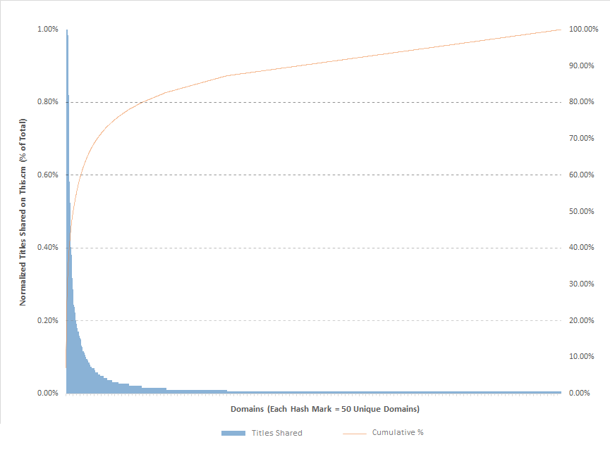
20% of This.cm submissions comes from six sources. In essence, 1 out of 5 links you see will be from one of these big players:

Moving up to 40% of the submissions on the site, the pool of domains expands by 31:
We can already see the distribution tail lengthening, but going up to 60% of submissions really shows the beginning of source diversity (and phenomenal usage of typography in branding).
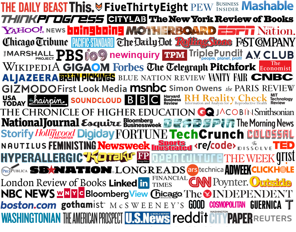
While I would love to visualize the next two buckets of domains in 20% cumulative usage, the long tail becomes overwhelming. One needs to add 637 domains to all of those above for 80% of submissions.
Here is the whammy of the long tail and quite possibly my favorite part of the This.cm experience: The final 20% is made up of 2,762 distinct domains. I love knowing that 4 out of 5 links I see on the site are likely from familiar domains, but that 5th link is likely from a shadowy corner of the internet with the bonus that it was personally recommended by a human being. Many of the most engaging and thoughtful pieces that I've been linked to from This.cm have come from the long tail, and I hope that the trend continues.
The problem with starting a little analysis like this is that I want to just keep plugging away, especially considering how enamored I am with what the users of the site have to offer and what a petri dish the social network is during its infancy and growth phases. I'll throw out a few more quick glances at things and then it's time to go hiking.
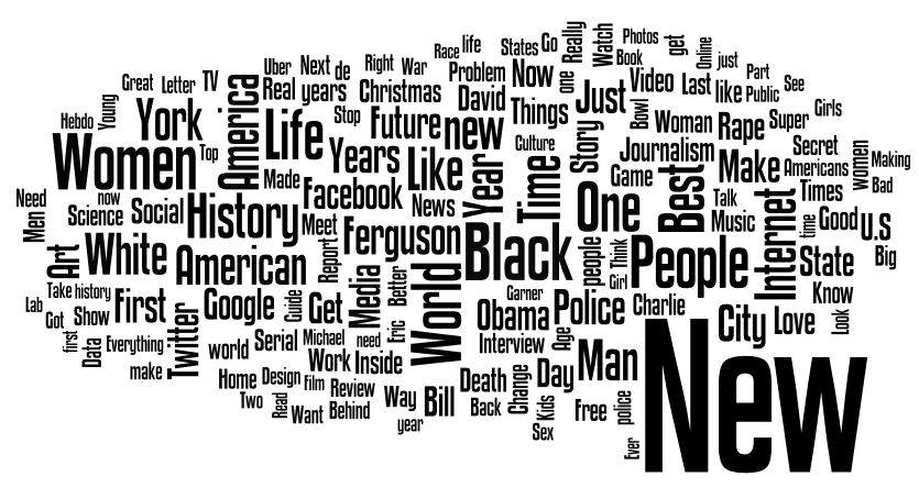
I don't have the time or energy to bust out complementary cumulated distribution plots around word usage in article titles or descriptive comments, but here is a simple word cloud of the titles posted on This.cm thus far in the sample I chose:
Here is the whammy of the long tail and quite possibly my favorite part of the This.cm experience: The final 20% is made up of 2,762 distinct domains. I love knowing that 4 out of 5 links I see on the site are likely from familiar domains, but that 5th link is likely from a shadowy corner of the internet with the bonus that it was personally recommended by a human being. Many of the most engaging and thoughtful pieces that I've been linked to from This.cm have come from the long tail, and I hope that the trend continues.
The problem with starting a little analysis like this is that I want to just keep plugging away, especially considering how enamored I am with what the users of the site have to offer and what a petri dish the social network is during its infancy and growth phases. I'll throw out a few more quick glances at things and then it's time to go hiking.
I don't have the time or energy to bust out complementary cumulated distribution plots around word usage in article titles or descriptive comments, but here is a simple word cloud of the titles posted on This.cm thus far in the sample I chose:
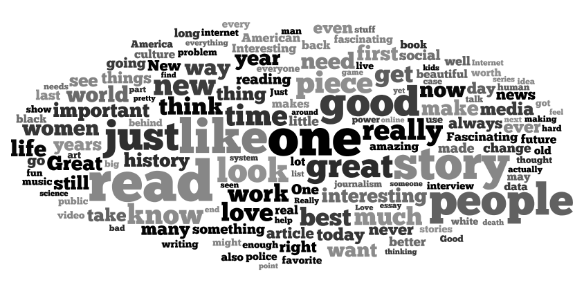
And the same for commentary by users describing their recommendations:
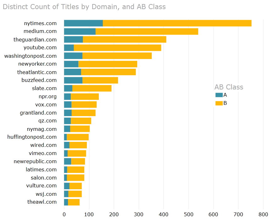
The last thing I started to look at was the relationship between "thanks" that users give to distinct recommendations and the source domains. Borrowing from the exciting world of materials management, I employed a quick variant of ABC analysis to show where 20% of titles account for 80% of thanks across the whole site, and how that plays out per domain (seen as "A," or the blue parts of the bars in the figure below). The figure just shows some of the most popular domains, but there is definitely something between the ratio of A:B that highlights viral recommendations.
The fun part of an initial analysis is that every viewpoint leads to more questions, and I'm happy to have the data modeled in a way that this may be explored more heavily down the road. One question I'd love to research is the impact of content providers joining This.cm - I noticed that when The New Republic came on board, submissions from the their domain exploded upon their arrival,
Network analysis would be fascinating to see the impact of thought-leaders as certain nodes. Tying the long tail of domains to metadata that summarizes their content (news, sociology, science, entertainment, etc.) and watching temporal trends would be a blast.
In any case, I love what This.cm provides thus far and it has been a pleasure participating in its offerings, being great things to read or fun data to play with.


 RSS Feed
